


Release 2026.7 - Design uplift and fixes

In this release, I decided to take a break from new features and focus on improving the overall experience of using the app. Like many other people, I like it when the app is pleasant to use and don’t like it when developers don’t pay enough attention to details. Unfortunately, you could say this about Kona if you attentive enough. I have been focusing on new features for too long, but now that Kona is finally closer than ever to my final vision, I can concentrate on polishing the app.
It’s a little bit painful to admit your mistakes, but let’s compare the previous version of Kona with the new one.
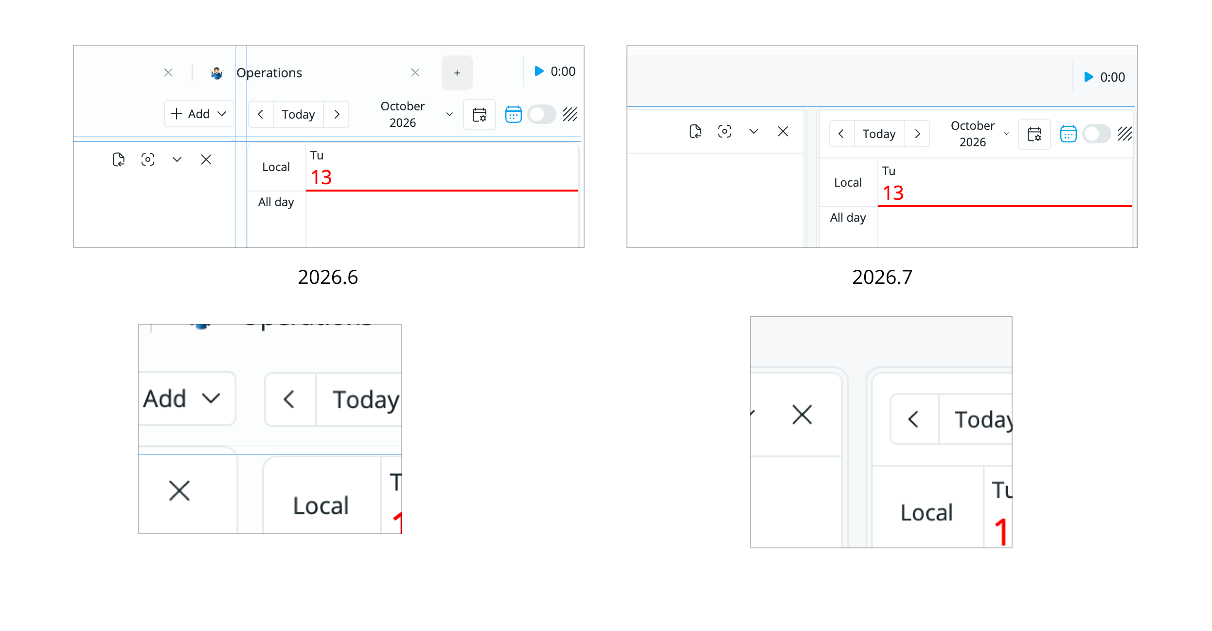
On the left side, you can see that the blocks were not aligned properly. That was a result of bad layout design on my part. In this release, I rebuilt it from scratch and eliminated such differences — now all the blocks are utilizing the global layout:
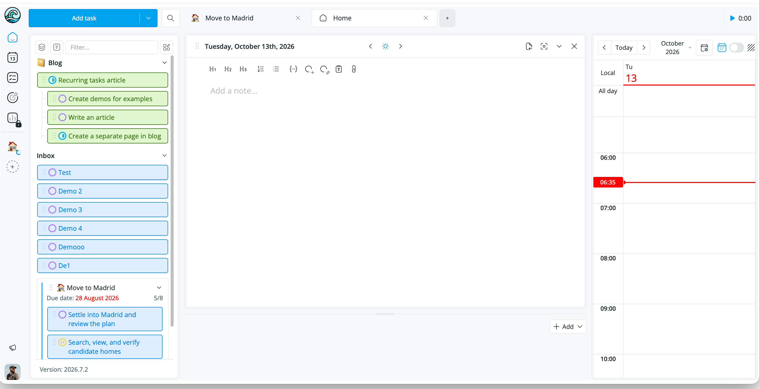
The left sidebar has the same position from the top as the right sidebar with the calendar.
The rebuilding of the layout allowed to fix another small issue:
When you switch from Projects to Goals, it used to repaint the side calendar and reset its position. Not a big deal, but still a bad user experience. Now it changes only the middle part:
The dark mode has received a lot of small fixes too. Let’s start with the notes:
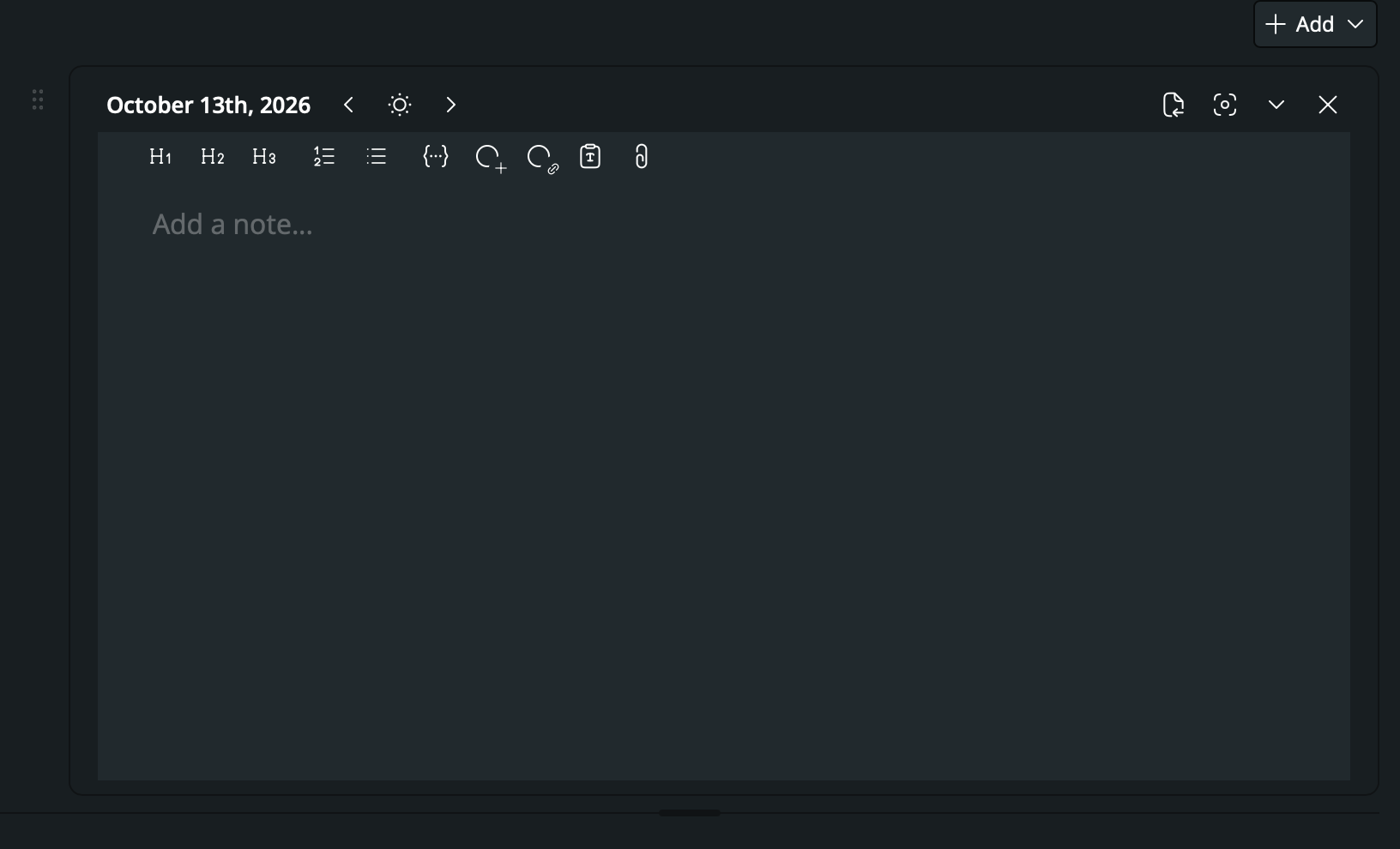
The note body didn’t suppose to have a different background! It irritated me for months and it’s finally fixed. Sorry that it took so long:
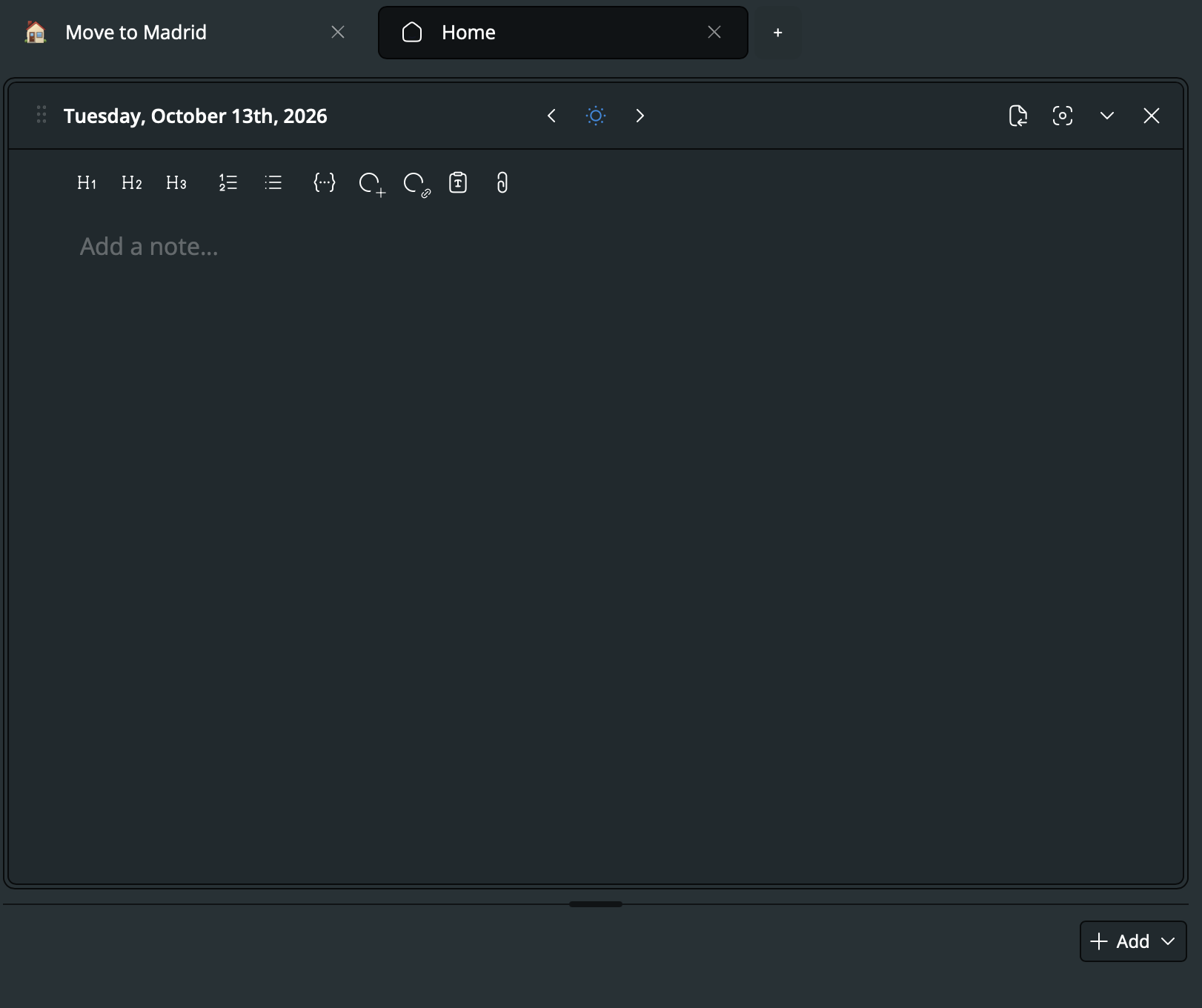
As you can see, the Home page design has been changed too. The drag handler is now inside the widget, so it doesn’t leave a weird empty space on the left. The navigation buttons (previous period, current, and next) have been moved to the center — this way they do not jump when you change from May to October, for example. «Add widget» button is now sits at the bottom, it used to eat a few pixels from the top.
Speaking of the dark theme, you can now switch to it right from the main menu:
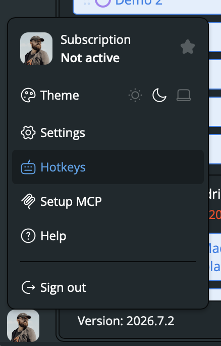
Here you can also open an instruction on setting up an MCP connection with you favorite AI-agent.
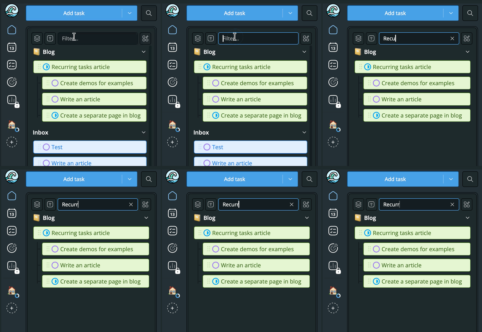
We added a filter input to the sidebar to make it easier to find an existing task or project:
I’m pretty sure that there are some paper cuts left, but much fewer than before and I will fix them eventually too. Stay tuned!
